
index.md 115 KB
localeCode: zh-CN order: 23 category: 输入类 title: Form 表单 icon: doc-form
dir: column
表单(Form)
- 按需重绘,避免了不必要的全量渲染, 性能更高
- 简单易用,结构极简,避免了不必要的层级嵌套
- 完善的无障碍支持
- 在 Form 外部可方便地获取 formState / fieldState
提供在外部对表单内部进行操作的方法:formApi / fieldApi - 支持将自定义组件封装成表单控件,你可以通过 Form 提供的扩展机制(withField HOC)快捷接入自己团队的组件
- 支持 Form level / Field level 级别的赋值、校验(同步/异步)
表单控件(Field)
Semi 将所有自带的输入控件(文本输入框、下拉选择、复选框、单选框等)都使用 withField 封装了一次。
接管了他们的数据流(value & onChange)
使用的时候,需要从 Form 中导出(注意:从 Form 导出的控件才具有数据同步功能)
目前 Form 提供了如下表单控件
Input、InputNumber、TextArea、Select、Checkbox、Radio、RadioGroup、Switch、DatePicker、TimePicker、Slider、InputGroup、TreeSelect、Cascader、Rating、AutoComplete、Upload、Label、ErrorMessage、Section、TagInput都挂载在 Form 下,使用时直接以 、声明即可import { Form } from '@douyinfe/semi-ui'; // 具有数据同步功能的表单控件,在<Form></Form>内使用时,数据流会被Form自动接管 // 从Form中导出表单控件时,你还可以进行重命名(这里命名为FormInput仅仅是为了在以下示例中跟普通Input做区分) const FormInput = Form.Input; const FormSelect = Form.Select; const Option = FormSelect.Option; // 普通Input,在<Form></Form>内部使用时,Form不会对其做任何处理 import { Input } from '@douyinfe/semi-ui';Form 提供的 Field 级别组件,它的 value(或者 valueKey 指定的其他属性)、onChange(或 onKeyChangeFnName 指定的其他回调函数) 属性都会被 Form 劫持,所以
1. 你不需要也不应该用 onChange 来作同步,当然你可以继续监听 onChange 事件获取最新的值2. 你不能再用控件的value、defaultValue、checked、defaultChecked等属性来设置表单控件的值,默认值可以通过 Field 的initValue或者 Form 的initValues设置3. 你不应该直接修改 FormState 的值,所有对 Form 内数据的修改都应该通过提供的formApi、fieldApi来完成代码演示
声明表单的多种写法
Semi Form 同时支持多种写法
基本写法
从 Form 中导出表单控件,给表单控件添加
field属性,将其放置于 Form 内部即可
还可以给每个表单控件设置label属性,不传入时默认与 field 相同
label可以直接传入字符串,亦可以以 object 方式声明,配置extra、required、optional等属性应对更复杂的场景对于Field级别组件来说,field 属性是必填项!
import React from 'react';
import { Form, Tooltip } from '@douyinfe/semi-ui';
import { IconHelpCircle } from '@douyinfe/semi-icons';

() => {
    const { Option } = Form.Select;

    return (
        <Form layout='horizontal' onValueChange={values=>console.log(values)}>
            <Form.Input field='UserName' label='用户名' style={{ width: 80 }}/>
            <Form.Input
                field='Password'
                label={{
                    text: '密码',
                    extra: <Tooltip content='详情'><IconHelpCircle style={{ color: 'var(--semi-color-text-2)' }}/></Tooltip>
                }}
                style={{ width: 176 }}
            />
            <Form.Select field="Role" label={{ text: '角色', optional: true }} style={{ width: 176 }}>
                <Option value="admin">管理员</Option>
                <Option value="user">普通用户</Option>
                <Option value="guest">访客</Option>
            </Form.Select>
        </Form>
    );
};
支持的其他写法
当你需要在 Form 结构内部直接获取到
formState、formApi、values等值时,你还可以使用以下的写法注意,此处获取的 formState、values 等并没有经过 deepClone。你应该只做读操作,而不应该做写操作,否则会导致你可能意外修改了form内部的状态。所有对 Form 内部状态的更新都应该通过 formApi 去操作通过 render 属性传入
即 render props
import React from 'react';
import { Form } from '@douyinfe/semi-ui';

() => {
    return (
        <Form render={({ formState, formApi, values }) => (
            <>
                <Form.Select field="Role" label='角色' style={{ width: 176 }}>
                    <Form.Select.Option value="admin">管理员</Form.Select.Option>
                    <Form.Select.Option value="user">普通用户</Form.Select.Option>
                    <Form.Select.Option value="guest">访客</Form.Select.Option>
                </Form.Select>
                <Form.Input field='UserName' label='用户名' style={{ width: 80 }}/>
                <Form.Input field='Password' label='密码' style={{ width: 176 }}/>
                <code style={{ marginTop: 24 }}>{JSON.stringify(formState)}</code>
            </>
        )} layout='horizontal' onValueChange={values=>console.log(values)}>
        </Form>
    );
};
通过 child render function
Form 的 children 是一个 function,return 出所有表单控件
import React from 'react';
import { Form } from '@douyinfe/semi-ui';

() => {
    return (
        <Form layout='horizontal' onValueChange={values=>console.log(values)}>
            {
                ({ formState, values, formApi }) => (
                    <>
                        <Form.Select field="Role" label='角色' style={{ width: 176 }}>
                            <Form.Select.Option value="admin">管理员</Form.Select.Option>
                            <Form.Select.Option value="user">普通用户</Form.Select.Option>
                            <Form.Select.Option value="guest">访客</Form.Select.Option>
                        </Form.Select>
                        <Form.Input field='UserName' label='用户名' style={{ width: 80 }} />
                        <Form.Input field='Password' label='密码' style={{ width: 176 }}/>
                        <code style={{ marginTop: 24 }}>{JSON.stringify(formState)}</code>
                    </>
                )
            }
        </Form>
    );
};
通过 props.component
通过 component 属性直接将整个内部结构以 ReactNode 形式传入
import React from 'react';
import { Form } from '@douyinfe/semi-ui';

() => {
    const fields = ({ formState, formApi, values }) => (
        <>
            <Form.Input field='Role' style={{ width: 176 }}/>
            <Form.Input field='UserName' style={{ width: 80 }}/>
            <Form.Input field='Password' style={{ width: 176 }}/>
            <code style={{ marginTop: 24 }}>{JSON.stringify(formState)}</code>
        </>
    );
    return <Form component={fields} layout='horizontal' onValueChange={values=>console.log(values)}/>;
};
已支持的表单控件
Form.TreeSelect、Form.Cascader、Form.Rating 在 v0.22.0 及之后的版本开始提供;
Form.AutoComplete 在 v0.28.0 及之后的版本开始提供
Form.Upload 在 v1.0.0 及之后的版本开始提供
Form.TagInput 在 v1.21.0 及之后的版本开始提供import React from 'react'; import { Form, Col, Row, Button } from '@douyinfe/semi-ui'; import { IconUpload } from '@douyinfe/semi-icons'; class BasicDemoWithInit extends React.Component { constructor() { super(); this.state = { initValues: { name: 'semi', business: ['ulikeCam'], role: 'ued', switch: true, files: [ { uid: '1', name: 'vigo.png', status: 'success', size: '130KB', preview: true, url: 'https://lf3-static.bytednsdoc.com/obj/eden-cn/ptlz_zlp/ljhwZthlaukjlkulzlp/root-web-sites/vigo.png' }, { uid: '2', name: 'resso.jpeg', status: 'validateFail', size: '222KB', percent: 50, preview: true, fileInstance: new File([new ArrayBuffer(2048)], 'resso.jpeg', { type: 'image/jpeg' }), url: 'https://lf3-static.bytednsdoc.com/obj/eden-cn/ptlz_zlp/ljhwZthlaukjlkulzlp/root-web-sites/Resso.png' }, { uid: '3', name: 'dy.jpeg', status: 'uploading', size: '222KB', percent: 50, preview: true, fileInstance: new File([new ArrayBuffer(2048)], 'dy.jpeg', { type: 'image/jpeg' }), url: 'https://lf3-static.bytednsdoc.com/obj/eden-cn/ptlz_zlp/ljhwZthlaukjlkulzlp/root-web-sites/dy.png' } ] } }; this.getFormApi = this.getFormApi.bind(this); } getFormApi(formApi) { this.formApi = formApi; } render() { const { Section, Input, InputNumber, AutoComplete, Select, TreeSelect, Cascader, DatePicker, TimePicker, TextArea, CheckboxGroup, Checkbox, RadioGroup, Radio, Slider, Rating, Switch, TagInput } = Form; const { initValues } = this.state; const plainOptions = ['A', 'B', 'C']; const style = { width: '90%' }; const treeData = [ { label: '亚洲', value: 'Asia', key: '0', children: [ { label: '中国', value: 'China', key: '0-0', children: [ { label: '北京', value: 'Beijing', key: '0-0-0', }, { label: '上海', value: 'Shanghai', key: '0-0-1', }, ], }, ], }, { label: '北美洲', value: 'North America', key: '1', } ]; return ( <Form getFormApi={this.getFormApi} initValues={initValues} style={{ padding: 10, width: '100%' }} onValueChange={(v)=>console.log(v)} > <Section text={'基本信息'}> <Row> <Col span={12}> <Input field="name" label="名称(Input)" initValue={'mikeya'} style={style} trigger='blur' /> </Col> <Col span={12}> <DatePicker field="date" label='日期(DatePicker)' style={style} initValue={new Date()} placeholder='请选择生效日期' /> </Col> </Row> <Row> <Col span={12}> <Select field="role" style={style} label='角色(Select)' placeholder='请选择你的角色'> <Select.Option value="operate">运营</Select.Option> <Select.Option value="rd">开发</Select.Option> <Select.Option value="pm">产品</Select.Option> <Select.Option value="ued">设计</Select.Option> </Select> </Col> <Col span={12}> <Select field="business" multiple style={style} placeholder='请选择业务线' label="业务线(多选Select)" extraText={ <div style={{ color: 'rgba(var(--semi-blue-5), 1)', fontSize: 14, userSelect: 'none', cursor: 'pointer' }}> 没有找到合适的业务线? </div> } > <Select.Option value="abc">Semi</Select.Option> <Select.Option value="ulikeCam">轻颜相机</Select.Option> <Select.Option value="toutiao">今日头条</Select.Option> </Select> </Col> </Row> <Row> <Col span={12}> <Form.Cascader placeholder="请选择所在地区" treeData={treeData} field='area' label='地区(Cascader)' style={style} > </Form.Cascader> </Col> <Col span={12}> <Form.TreeSelect field="tree" style={style} label='节点(TreeSelect)' placeholder='请选择服务节点' treeData={treeData} filterTreeNode > </Form.TreeSelect> </Col> </Row> <Row> <Col span={12}> <TagInput field="product" label='产品(TagInput)' initValue={['abc', 'ulikeCam']} placeholder='请输入产品' style={style} /> </Col> </Row> <Row> <Col span={24}> <Form.Upload field='files' label='证明文件(Upload)' action='//semi.design/api/upload' > <Button icon={<IconUpload />} theme="light"> 点击上传 </Button> </Form.Upload> </Col> </Row> </Section> <Section text='资源详情'> <Row> <Col span={12}> <TextArea style={{ ...style, height: 120 }} field='description' label='申请理由(TextArea)' placeholder='请填写申请资源理由' /> </Col> <Col span={12}> <CheckboxGroup field="type" direction='horizontal' label='申请类型(CheckboxGroup)' initValue={['user', 'admin']} rules={[ { required: true } ]} > <Checkbox value="admin">admin</Checkbox> <Checkbox value="user">user</Checkbox> <Checkbox value="guest">guest</Checkbox> <Checkbox value="root">root</Checkbox> </CheckboxGroup> <RadioGroup field="isMonopolize" label='是否独占资源(Radio)' rules={[ { type: 'boolean' }, { required: true, message: '必须选择是否独占 ' } ]}> <Radio value={true}>是</Radio> <Radio value={false}>否</Radio> </RadioGroup> </Col> </Row> <Row> <Col span={12}> <TimePicker field="time" label='截止时刻(TimePicker)' style={{ width: '90%' }}/> </Col> <Col span={12}> <InputNumber field='number' label='申请数量(InputNumber)' initValue={20} style={style}/> </Col> </Row> <Row> <Col span={12}> <Slider field="range" label='资源使用报警阈值(%)(Slider)' initValue={10} style={{ width: '90%' }}/> </Col> <Col span={12}> <Switch field='switch' label='开关(Switch)'/> </Col> </Row> <Row> <Col span={12}> <Rating field="rating" label='满意度(Rating)' initValue={2} style={{ width: '90%' }}/> </Col> </Row> </Section> <Checkbox value="false" field="agree" noLabel={true}> 我已阅读并清楚相关规定(Checkbox) </Checkbox> <Button type="primary" htmlType="submit" className="btn-margin-right">提交(submit)</Button> <Button htmlType="reset">重置(reset)</Button> </Form> ); } }表单控件值的绑定
每个表单控件都需要以
field属性绑定一个字段名称,用于将表单项的值正确映射到FormStatevalues / errors / touched 中
字段可以是简单的字符串,可以是包含.或者[]的字符串, 支持多级嵌套
下面是字段名称以及他们在 FormState 中的映射路径的示例Field Resolution username formState.values.username user[0] formState.values.user[0] siblings.1 formState.values.siblings[1] siblings['2'] formState.values.siblings[2] parents[0].name formState.values.parents[0].name parents[1]['name'] formState.values.parents[1].name import React from 'react'; import { Form, Toast, Row, Col, TextArea } from '@douyinfe/semi-ui'; () => ( <Form onSubmit={values => Toast.info({ content: JSON.stringify(values) })} > { ({ formState, values, formApi }) => ( <Row> <Col span={12}> <Form.Input field='username' placeholder='请尝试输入值'/> <Form.Input field='user[0]' placeholder='请尝试输入值'/> <Form.Input field='siblings.1' placeholder='请尝试输入值'/> <Form.Input field="siblings['2']" placeholder='请尝试输入值'/> <Form.Input field='parents[0].name' placeholder='请尝试输入值'/> <Form.Input field="parents[1]['name']" placeholder='请尝试输入值'/> </Col> <Col span={10} offset={1} style={{ marginTop: 12 }}> <Form.Label text='FormState实时映射值:'></Form.Label> <TextArea value={JSON.stringify(formState.values)}></TextArea> </Col> </Row> ) } </Form> );表单布局
垂直布局:表单控件之间上下垂直排列(默认)
Semi Design 更推荐表单采用垂直布局import React from 'react'; import { Form, Toast, Button } from '@douyinfe/semi-ui'; () => { const handleSubmit = (values) => { console.log(values); Toast.info('表单已提交'); }; return ( <Form onSubmit={values => handleSubmit(values)} style={{ width: 400 }}> {({ formState, values, formApi }) => ( <> <Form.Input field='phone' label='PhoneNumber' style={{ width: '100%' }} placeholder='Enter your phone number'></Form.Input> <Form.Input field='password' label='Password' style={{ width: '100%' }} placeholder='Enter your password'></Form.Input> <Form.Checkbox field='agree' noLabel>I have read and agree to the terms of service</Form.Checkbox> <div style={{ display: 'flex', justifyContent: 'space-between', alignItems: 'center' }}> <p> <span>Or</span><Button theme='borderless' style={{ color: 'var(--semi-color-primary)', marginLeft: 10, cursor: 'pointer' }}>Sign up</Button> </p> <Button disabled={!values.agree} htmlType='submit' type="tertiary">Log in</Button> </div> </> )} </Form> ); };水平布局:表单控件之间水平排列 你可以通过设置
layout='horizontal'来使用水平布局import React from 'react'; import { Form } from '@douyinfe/semi-ui'; () => ( <Form layout='horizontal'> <Form.Input field='phone' label='PhoneNumber' placeholder='Enter your phone number'></Form.Input> <Form.Input field='password' label='Password' placeholder='Enter your password'></Form.Input> </Form> );labelPosition、labelAlign
你可以通过设置 labelPosition、labelAlign 控制 label 在 Field 中出现的位置,文本对齐的方向import React from 'react'; import { Form, Select } from '@douyinfe/semi-ui'; class BasicDemo extends React.Component { constructor() { super(); this.state = { labelPosition: 'left', labelAlign: 'left', labelWidth: '180px' }; this.changeLabelPos = this.changeLabelPos.bind(this); this.changeLabelAlign = this.changeLabelAlign.bind(this); } changeLabelPos(labelPosition) { let labelWidth; labelPosition === 'left' ? labelWidth = '180px' : labelWidth = 'auto'; this.setState({ labelPosition, labelWidth }); } changeLabelAlign(labelAlign) { this.setState({ labelAlign }); } render() { const { labelPosition, labelAlign, labelWidth } = this.state; return ( <> <div style={{ borderBottom: '1px solid var(--semi-color-border)', paddingBottom: 12 }}> <Form.Label style={{ marginLeft: 10 }}>切换Label位置:</Form.Label> <Select onChange={this.changeLabelPos} value={labelPosition} style={{ width: 200 }} insetLabel='labelPosition'> <Select.Option value='top'>top</Select.Option> <Select.Option value='left'>left</Select.Option> </Select> <Form.Label style={{ marginLeft: 10 }}>切换Label文本对齐方向:</Form.Label> <Select onChange={this.changeLabelAlign} value={labelAlign} style={{ width: 200 }} insetLabel='labelAlign'> <Select.Option value='left'>left</Select.Option> <Select.Option value='right'>right</Select.Option> </Select> </div> <Form labelPosition={labelPosition} labelWidth={labelWidth} labelAlign={labelAlign} key={labelPosition + labelAlign} style={{ padding: '10px', width: 600 }}> <Form.Input field="input" label="手机号码" trigger='blur' style={{ width: 200 }} rules={[ { required: true, message: 'required error' }, { type: 'string', message: 'type error' }, { validator: (rule, value) => value === 'semi', message: 'should be semi' } ]} /> <Form.Switch label="是否同意" field='agree'/> <Form.InputNumber field='price' label='价格' style={{ width: 200 }}/> <Form.Select label="姓名" field='name' style={{ width: 200 }}> <Form.Select.Option value="mike">mike</Form.Select.Option> <Form.Select.Option value="jane">jane</Form.Select.Option> <Form.Select.Option value="kate">kate</Form.Select.Option> </Form.Select> <Form.CheckboxGroup label="角色" field='role' direction='horizontal'> <Form.Checkbox value="admin">admin</Form.Checkbox> <Form.Checkbox value="user">user</Form.Checkbox> <Form.Checkbox value="guest">guest</Form.Checkbox> <Form.Checkbox value="root">root</Form.Checkbox> </Form.CheckboxGroup> <Form.RadioGroup field="性别"> <Form.Radio value="1">man</Form.Radio> <Form.Radio value="2">woman</Form.Radio> </Form.RadioGroup> </Form> </> ); } }更复杂的布局 你还可以结合 Grid 提供的 Row、Col,来对表单进行你想要的排列
import React from 'react';
import { Form, Col, Row } from '@douyinfe/semi-ui';

() => (
<Form
    labelPosition='top'
    getFormApi={this.getFormApi}
    style={{ padding: '10px' }}>
    <Row>
        <Col span={8}>
            <Form.Input
                field="nickName1"
                label="用户名"
                style={{ width: '250px' }}
                trigger='blur'
                rules={[
                    { required: true, message: 'required error' },
                    { type: 'string', message: 'type error' },
                    { validator: (rule, value) => value === 'semi', message: 'shoulde be semi' }
                ]}
            />
        </Col>
        <Col span={8}>
            <Form.DatePicker field='date1' label='有效日期' style={{ width: '250px' }}/>
        </Col>
        <Col span={8}>
            <Form.Select label="业务线" field='business1' style={{ width: '250px' }}>
                <Form.Select.Option value="abc">Semi</Form.Select.Option>
                <Form.Select.Option value="ulikeCam">轻颜相机</Form.Select.Option>
                <Form.Select.Option value="toutiao">今日头条</Form.Select.Option>
            </Form.Select>
        </Col>
    </Row>
    <Row>
        <Col span={6}>
            <Form.Input
                field="nickName2"
                label="用户名"
                style={{ width: '200px' }}
                trigger='blur'
                rules={[
                    { required: true, message: 'required error' },
                    { type: 'string', message: 'type error' },
                    { validator: (rule, value) => value === 'semi', message: 'should be semi' }
                ]}
            />
        </Col>
        <Col span={6}>
            <Form.DatePicker field='date2' label='有效日期' style={{ width: '200px' }}/>
        </Col>
        <Col span={6}>
            <Form.Select label="业务线" field='business2' style={{ width: '200px' }}>
                <Form.Select.Option value="abc">Semi</Form.Select.Option>
                <Form.Select.Option value="ulikeCam">轻颜相机</Form.Select.Option>
                <Form.Select.Option value="toutiao">今日头条</Form.Select.Option>
            </Form.Select>
        </Col>
        <Col span={6}>
            <Form.Select field="role" label='角色' style={{ width: '200px' }}>
                <Form.Select.Option value="operate">运营</Form.Select.Option>
                <Form.Select.Option value="rd">开发</Form.Select.Option>
                <Form.Select.Option value="pm">产品</Form.Select.Option>
                <Form.Select.Option value="ued">设计</Form.Select.Option>
            </Form.Select>
        </Col>
    </Row>
</Form>
);
表单分组
字段数量较多的表单应考虑对字段进行分组,可以使用
Form.Section对 Fields 进行分组(仅影响布局,不会影响数据结构)import React from 'react'; import { Form, Button, Space } from '@douyinfe/semi-ui'; () => { const { Section, Input, DatePicker, TimePicker, Select, Switch, InputNumber, Checkbox, CheckboxGroup, RadioGroup, Radio } = Form; return ( <Form style={{ width: 560 }}> <Section text={'基本信息'}> <Input field='name' label='考试名称' initValue='TCS任务平台使用' style={{ width: 560 }}/> </Section> <Section text={'合格标准'} > <div style={{ display: 'flex' }}> <InputNumber field='pass' initValue={60} style={{ width: 80 }} label={{ text: '及格正确率', required: true }}/> <InputNumber field='number' initValue={10} style={{ width: 80 }} label={{ text: '合格人数', required: true }}/> </div> </Section> <Section text={'考试时间'} > <DatePicker field='date' type='dateTime' initValue={new Date()} style={{ width: 272 }} label={{ text: '开始时间', required: true }}/> <div style={{ display: 'flex' }}> <Input field='time' label='考试时长' style={{ width: 176 }} initValue={'60'} addonAfter='分钟'/> <Checkbox initValue={true} noLabel field='auto' style={{ paddingTop: 30, marginLeft: 12 }}>到时间自动交卷</Checkbox> </div> <RadioGroup field="type" label='有效时间' direction='vertical' initValue={'always'} > <Radio value="always">永久有效</Radio> <Radio value="user">自定义有效期</Radio> </RadioGroup> <RadioGroup field="answerTime" label='答案放出时间' direction='vertical' initValue={'always'} rules={[ { required: true } ]} > <Radio value="always">自动放出</Radio> <Radio value="user"> <div style={{ display: 'inline-block' }}> 自定义放出时间 <Form.DatePicker type='dateTimeRange' noLabel field='customTime' style={{ width: 464, display: 'inline-block' }}/> </div> </Radio> </RadioGroup> </Section> <Section text={'考试人员'}> <div style={{ display: 'flex' }}> <Switch field='open' label={{ text: '对外开放', required: true }} checkedText='开' uncheckedText='关'></Switch> </div> <Select field='users' label={{ text: '考生', required: true }} style={{ width: 560 }} multiple initValue={['1', '2', '3', '4']} > <Select.Option value='1'>曲晨一</Select.Option> <Select.Option value='2'>夏可曼</Select.Option> <Select.Option value='3'>曲晨三</Select.Option> <Select.Option value='4'>蔡妍</Select.Option> </Select> </Section> <Space> <Button type='primary' theme='solid' style={{ width: 120, marginTop: 12, marginRight: 4 }}>创建考试</Button> <Button style={{ marginTop: 12 }}>预览</Button> </Space> </Form> ); };wrapperCol / labelCol
需要为 Form 内的所有 Field 设置统一的布局时,可以在 Form 上设置 wrapperCol 、labelCol 快速生成布局,无需手动使用 Row、Col 手动布局
wrapperCol、labelCol属性配置参考Col 组件import React from 'react'; import { Form } from '@douyinfe/semi-ui'; () => ( <Form wrapperCol={{ span: 20 }} labelCol={{ span: 2 }} labelPosition='left' labelAlign='right' > <Form.Input field='name' style={{ width: 250 }} label='姓名' trigger='blur' placeholder='请输入姓名'/> <Form.Select field="role" label='角色' placeholder='请选择角色' style={{ width: 250 }}> <Form.Select.Option value="operate">运营</Form.Select.Option> <Form.Select.Option value="rd">开发</Form.Select.Option> <Form.Select.Option value="pm">产品</Form.Select.Option> <Form.Select.Option value="ued">设计</Form.Select.Option> </Form.Select> </Form> );隐藏Label
Form 会自动为 Field 控件插入 Label。如果你不需要自动插入 Label 模块, 可以通过在 Field 中设置
noLabel=true将自动插入 Label 功能关闭(此时 Field 仍然具备自动展示 ErrorMessage 的能力,因此 DOM 结构与原始控件依然会有区别)
如果你希望与原始控件保持 DOM 结构一致,可以使用 pure=true,此时除了数据流被接管外,DOM结构不会有任何变化(你需要自行负责 ErrorMessage的渲染,同时它也无法被 formProps.wrapperCol 属性影响)import React from 'react'; import { Form } from '@douyinfe/semi-ui'; () => ( <Form onSubmit={(values) => console.log(values)} style={{ width: 400 }}> <Form.Input field='name' label='姓名' trigger='blur' noLabel={true} style={{ width: 250 }} placeholder='请输入姓名'/> <Form.Input field='purename' pure placeholder='DOM结构与普通 Input 组件完全一致'/> </Form> );内嵌 Label
通过将 labelPosition 设为
inset,可以将 Label 内嵌在表单控件中。目前支持这项功能的组件有Input、InputNumber、DatePicker、TimePicker、Select、TreeSelect、Cascader、TagInputimport React from 'react'; import { Form } from '@douyinfe/semi-ui'; () => ( <Form labelPosition='inset' layout='horizontal'> <Form.Input field='name' label='姓名' trigger='blur' style={{ width: 250 }} placeholder='请输入姓名' initValue='semi'/> <Form.Select field="role" label='角色' style={{ width: '250px' }} initValue='rd'> <Form.Select.Option value="operate">运营</Form.Select.Option> <Form.Select.Option value="rd">开发</Form.Select.Option> <Form.Select.Option value="pm">产品</Form.Select.Option> <Form.Select.Option value="ued">设计</Form.Select.Option> </Form.Select> <Form.DatePicker field="date" label='开始日期' style={{ width: '250px' }} initValue={new Date()}> </Form.DatePicker> </Form> );导出 Label、ErrorMessage 使用
如果你需要 Form.Label、Form.ErrorMessage 模块自行组合使用,可以从 Form 中导出
- Label 的 API 详见 Label
- ErrorMessage 的 API 详见 ErrorMessage
例如:当自带的 Label、ErrorMessage 布局不满足业务需求,需要自行组合位置,但又希望能直接使用 Label、ErrorMessage 的默认样式时
import { Form } from '@douyinfe/semi-ui';
const { Label, ErrorMessage } = Form;
使用 Form.Slot 放置自定义组件
当你的自定义组件,需要与 Field 组件保持同样的布局样式时,你可以通过 Form.Slot 放置你的自定义组件
在 Form 组件上设置的labelWidth、labelAlign、wrapperCol、labelCol会自动作用在 Form.Slot 上
Slot 属性配置详见Form.Slotimport React from 'react'; import { Form } from '@douyinfe/semi-ui'; class AssistComponent extends React.Component { render() { return ( <Form onChange={v=>console.log(v)} onSubmit={v=>console.log(v)} style={{ width: 600 }} labelPosition='left' labelWidth={100} > <Form.Input field='特效名称' style={{ width: 250 }}/> <Form.Slot label={{ text: 'SlotA' }}> <div style={{ display: 'flex', alignItems: 'center', height: '100%' }}> 我是Semi Form SlotA, 我是自定义的ReactNode </div> </Form.Slot> <Form.Slot label={{ text: 'SlotB', width: 160, align: 'right' }}> <div style={{ display: 'flex', alignItems: 'center', height: '100%' }}> 我是Semi Form SlotB, 我的Label Align、Width与众不同 </div> </Form.Slot> </Form> ); } }使用 helpText、extraText 放置提示信息
可以通过
helpText放置自定义提示信息,与校验信息(error)公用同一区块展示,两者均有值时,优先展示校验信息。
可以通过extraText放置额外的提示信息,当需要错误信息和提示文案同时出现时,可以使用这个配置,常显,位于 helpText/error 后
当传入 validateStatus 时,优先展示 validateStatus 值对应的 UI 样式。不传入时,以 field 内部校验状态为准。import React from 'react'; import { Form } from '@douyinfe/semi-ui'; () => { const [helpText, setHelpText] = useState(''); const [validateStatus, setValidateStatus] = useState('default'); const formRef = useRef(); const validate = (val, values) => { if (!val) { setValidateStatus('error'); return <span>密码不能为空</span>; } else if (val && val.length <= 3) { setValidateStatus('warning'); setHelpText(<span style={{ color: 'var(--semi-color-warning)' }}>密码强度:弱</span>); // show helpText return ''; // validate pass } else { setHelpText(''); setValidateStatus('success'); return ''; } }; const random = () => { let pw = (Math.random() * 100000).toString().slice(0, 5); formRef.current.formApi.setValue('Password', pw); formRef.current.formApi.setError('Password', ''); setHelpText(''); setValidateStatus('success'); }; return ( <Form showValidateIcon={true} ref={formRef} onSubmit={(value) => console.log('submit success')} onSubmitFail={(errors) => console.log(errors)} > <Form.Input validate={validate} field="Password" validateStatus={validateStatus} helpText={helpText} extraText={ <div style={{ color: 'var(--semi-color-link)', fontSize: 14, userSelect: 'none', cursor: 'pointer' }} onClick={random} > 没有想到合适的密码?点击随机生成一个 </div> } ></Form.Input> </Form> ); };通过配置
extraTextPosition,你可以控制 extraText 的显示位置。可选值bottom、middle
例如如当你希望将 extraText 提示信息显示在 Label 与 Field 控件中间时
该属性可在 Form 上统一配置,亦可在每个 Field 上单独配置,同时传入时,以 Field 的配置为准。import React from 'react'; import { Form } from '@douyinfe/semi-ui'; () => { const options = [ { label: '飞书通知', value: 'lark' }, { label: '邮件通知', value: 'email' }, { label: '顶部横幅通知', value: 'notification' } ]; const notifyText = '未勾选时,默认为红点提醒,消息默认进入收件人消息列表。对于重要通知,可同时勾选相应的通知方式。'; const forceText = '对于对话框通知,可指定该消息必须在指定时长后才可置为已读。'; return ( <Form extraTextPosition='middle'> <Form.CheckboxGroup direction='horizontal' field='notify' label='通知方式' extraText={notifyText} options={options} /> <Form.InputNumber field='force' label='强制读取(可选)' placeholder='秒' extraText={forceText} extraTextPosition='bottom'/> </Form> ); };使用 InputGroup 组合多个 Field
当你需要将一些表单控件组合起来使用时,你可以用
Form.InputGroup将其包裹起来
当你给Select、Input等表单控件加上 field 属性时,Form会默认给每个 Field 控件自动插入Label
而在InputGroup中一般仅需要一个属于整个 Group 的 Label,你可以在 InputGroup 中设置 label 属性,插入一个属于 Group 的Label
label可配置属性详见Labelimport React from 'react'; import { Form, Button } from '@douyinfe/semi-ui'; () => ( <Form onSubmit={(values) => console.log(values)} labelPosition='top' style={{ width: 400 }}> <Form.InputGroup label={{ text: (<span>手机号码</span>), required: true }} labelPosition='top'> <Form.Select style={{ width: 150 }} field='phonePrefix' initValue='+86' rules={[{ required: true }]} showClear> <Form.Select.Option value='+1'>美国+1</Form.Select.Option> <Form.Select.Option value='+852'>香港+852</Form.Select.Option> <Form.Select.Option value='+86'>中国+86</Form.Select.Option> <Form.Select.Option value='+81'>日本+81</Form.Select.Option> </Form.Select> <Form.Input initValue='18912345678' style={{ width: 250 }} field='phoneNumber' rules={[{ required: true }]} showClear /> </Form.InputGroup> <Form.Input field='姓名' trigger='blur' initValue='Semi'></Form.Input> <Button htmlType='submit'>提交</Button> </Form> );Modal 弹出层中的表单
你可以将 Form 放置于 Modal 中,以弹窗形式承载
在提交时,通过 formApi.validate()对 Field 进行集中校验import React from 'react'; import { Form, Modal, Button, Row, Col } from '@douyinfe/semi-ui'; class ModalFormDemo extends React.Component { constructor(props) { super(props); this.state = { visible: false, }; this.showDialog = this.showDialog.bind(this); this.handleOk = this.handleOk.bind(this); this.handleCancel = this.handleCancel.bind(this); this.getFormApi = this.getFormApi.bind(this); } showDialog() { this.setState({ visible: true }); } handleOk() { this.formApi.validate() .then((values) => { console.log(values); }) .catch((errors) => { console.log(errors); }); } handleCancel() { this.setState({ visible: false }); } getFormApi(formApi) { this.formApi = formApi; } render(){ const { visible } = this.state; let message = '该项为必填项'; return ( <> <Button onClick={this.showDialog}>打开弹窗</Button> <Modal title="新建" visible={visible} onOk={this.handleOk} style={{ width: 600 }} onCancel={this.handleCancel} > <Form getFormApi={this.getFormApi} > <Row> <Col span={5}> <Form.Select field='region' label="国家/地区" placeholder='请选择' style={{ width: '100%' }} rules={[ { required: true, message }, ]} > <Form.Select.Option value="China">中国</Form.Select.Option> <Form.Select.Option value="US">美国</Form.Select.Option> <Form.Select.Option value="Europe">欧洲</Form.Select.Option> <Form.Select.Option value="Japan">日本</Form.Select.Option> </Form.Select> </Col> <Col span={15} offset={2}> <Form.Input field='owner' label="业务执行人" trigger='blur' rules={[ { required: true, message }, ]} /> </Col> </Row> <Row> <Col span={5}> <Form.Select field='area' label="投放区域" placeholder='请选择' style={{ width: '100%' }} rules={[ { required: true, message }, ]} > <Form.Select.Option value="China">中国</Form.Select.Option> <Form.Select.Option value="US">美国</Form.Select.Option> <Form.Select.Option value="Europe">欧洲</Form.Select.Option> <Form.Select.Option value="Japan">日本</Form.Select.Option> </Form.Select> </Col> <Col span={15} offset={2}> <Form.Input field='department' label="业务执行部门" trigger='blur' rules={[ { required: true, message }, ]} /> </Col> </Row> </Form> </Modal> </> ); } }配置初始值与校验规则
- 你可以通过
rules为每个 Field 表单控件配置校验规则
Form 内部的校验库基于 async-validator,更多配置规则可查阅其官方文档 你可以通过 form 的
initValues为整个表单统一设置初始值,也可以在每个 field 中通过initValue设置初始值(后者优先级更高)import React from 'react'; import { Form, Button } from '@douyinfe/semi-ui'; class BasicDemoWithInit extends React.Component { constructor() { super(); this.state = { initValues: { name: 'semi', role: 'rd' } }; this.getFormApi = this.getFormApi.bind(this); } getFormApi(formApi) { this.formApi = formApi; } render() { const { Select, Input } = Form; const style = { width: '100%' }; return ( <Form initValues={this.state.initValues}> <Input field="name" label="名称(Input)" style={style} trigger='blur' rules={[ { required: true, message: 'required error' }, { type: 'string', message: 'type error' }, { validator: (rule, value) => value === 'semi', message: 'should be semi' } ]} /> <Select field="role" style={style} label='角色' placeholder='请选择你的角色' initValue={'pm'}> <Select.Option value="operate">运营</Select.Option> <Select.Option value="rd">开发</Select.Option> <Select.Option value="pm">产品</Select.Option> <Select.Option value="ued">设计</Select.Option> </Select> <Button htmlType='submit'>提交</Button> </Form> ); } }
自定义校验(Form 级别)
你可以给
Form整体设置自定义校验函数 validateFields。submit 或调用formApi.validate()时会进行调用当配置了 Form级别校验器 validateFields 后,Field 级别的校验器(fieldProps.validate、fieldProps.rules 将不再生效)同步校验
校验通过时,你应该返回一个空字符串;
校验失败时,你应该返回错误信息(Object,key 为 fieldName,value 为对应的错误信息)import React from 'react'; import { Form, Button } from '@douyinfe/semi-ui'; class FormLevelValidateSync extends React.Component { constructor() { super(); this.syncValidate = this.syncValidate.bind(this); } syncValidate(values) { const errors = {}; if (values.name !== 'mike') { errors.name = 'you must name mike'; } if (values.sex !== 'female') { errors.sex = 'must be woman'; } errors.familyName = [ { before: 'before errror balabala ', after: 'after error balabala' }, 'familyName[1] error balabala' ]; return errors; } render() { return ( <Form validateFields={this.syncValidate} layout='horizontal'> <Form.Input field='name' trigger='blur'></Form.Input> <Form.Input field='familyName[0].before' trigger='blur'></Form.Input> <Form.Input field='familyName[0].after' trigger='blur'></Form.Input> <Form.Input field='familyName[1]' trigger='blur'></Form.Input> <div style={{ display: 'flex', alignItems: 'flex-end' }}> <Button type="primary" htmlType="submit" className="btn-margin-right"> Submit </Button> <Button htmlType="reset">reset</Button> </div> </Form > ); } }异步校验
异步校验时,你应当返回一个 promise,在 promise.then()中 你需要 return 对应的错误信息
import React from 'react';
import { Form, Button } from '@douyinfe/semi-ui';

class FormLevelValidateAsync extends React.Component {
    constructor() {
        super();
        this.asyncValidate = this.asyncValidate.bind(this);
    }

    asyncValidate(values) {
        const sleep = ms => new Promise(resolve => setTimeout(resolve, ms));
        return sleep(2000).then(() => {
            let errors = {};
            if (values.name !== 'mike') {
                errors.name = 'you must name mike';
            }
            if (values.sex !== 'female') {
                errors.sex = 'sex not valid';
            }
            return errors;
        });
    }

    render() {
        return (
            <Form validateFields={this.asyncValidate} layout='horizontal'>
                <Form.Input field='name' trigger='blur'></Form.Input>
                <Form.Input field='familyName[0].before' trigger='blur'></Form.Input>
                <Form.Input field='familyName[1]' trigger='blur'></Form.Input>
                <Form.Input field='sex' trigger='blur'></Form.Input>
                <div style={{ display: 'flex', alignItems: 'flex-end' }}>
                    <Button type="primary" htmlType="submit" className="btn-margin-right">
                        Submit
                    </Button>
                    <Button htmlType="reset">reset</Button>
                </div>
            </Form >
        );
    }
}
自定义校验(Field 级别)
你可以指定单个表单控件的自定义校验函数,支持同步、异步校验(通过返回 promise)
import React from 'react';
import { Form, Button } from '@douyinfe/semi-ui';

class FieldLevelValidateDemo extends React.Component {
    constructor() {
        super();
        this.validateName = this.validateName.bind(this);
        this.asyncValidate = this.asyncValidate.bind(this);
    }

    validateName(val) {
        if (!val) {
            return '【sync】can\'t be empty';
        } else if (val.length <= 5) {
            return '【sync】must more than 5';
        }
        return '';
    }

    asyncValidate(val, values) {
        const sleep = ms => new Promise(resolve => setTimeout(resolve, ms));
        return sleep(2000).then(() => {
            if (!val) {
                return '【async】can\'t be empty';
            } else if (val.length <= 5) {
                return '【async】must more than 5';
            } else {
                return '';
            }
        });
    }

    render() {
        return (
            <Form>
                <Form.Input field='name' label='【name】asyncValidate after 2s' validate={this.asyncValidate} trigger='blur'></Form.Input>
                <Form.Input field='familyName' label='【familyName】syncValidate' validate={this.validateName} trigger='blur'></Form.Input>
                <Button htmlType="reset">reset</Button>
            </Form >
        );
    }
}
手动触发指定 Field 校验
当你希望手动触发某些特定 Field 的校验操作时,可以通过 formApi.validate 完成。不传入参数时,默认对全部 Field 进行校验,传入参数时,以参数指定为准
import React from 'react';
import { Form, Button, Space } from '@douyinfe/semi-ui';
class PartValidAndResetDemo extends React.Component {
    constructor() {
        super();
        this.validate = this.validate.bind(this);
        this.getFormApi = this.getFormApi.bind(this);
        this.validatePartial = this.validatePartial.bind(this);
        this.resetPartial = this.resetPartial.bind(this);
    }

    getFormApi(formApi) {
        this.formApi = formApi;
    }

    validate(val) {
        if (!val) {
            return 'can\'t be empty';
        } else if (val.length <= 5) {
            return (<span>我是传入的reactNode</span>);
        }
        return;
    }

    validatePartial(type) {
        let scope = this.formApi.getValue('validateScope');
        !scope ? scope = [] : null;
        type === 'all' ? scope = ['a', 'b', 'c', 'd', 'b.name'] : null;
        this.formApi.validate(scope)
            .then(values => {
                console.log(values);
                Toast.success('pass');
            }).catch(error => {
                Toast.error('error');
                console.log(error);
            });
    }

    resetPartial() {
        let scope = this.formApi.getValue('resetScope');
        this.formApi.reset(scope);
    }

    render() {
        let options = ['a', 'b', 'c', 'd', 'b.name'].map(item => ({ label: item, value: item }));
        return (
            <Form getFormApi={this.getFormApi} autoScrollToError layout='horizontal'>
                {
                    ({ formState, values, formApi }) => (
                        <>
                            <div>
                                <Form.Input field="a[1]" validate={this.validate} trigger="blur" />
                                <Form.Input field="a[0]" validate={this.validate} trigger="blur" />
                                <Form.Input field="b.name[0]" validate={this.validate} trigger="blur" />
                                <Form.Input field="b.name[1]" validate={this.validate} trigger="blur" />
                                <Form.Input field="b.type" validate={this.validate} trigger="blur" />
                                <Form.Input field="c" validate={this.validate} trigger="blur" />
                                <Form.Input field="d" validate={this.validate} trigger="blur" />
                            </div>
                            <div>
                                <Form.CheckboxGroup options={options} field="validateScope" label="当前希望校验的Field" initValue={['a', 'b']} direction="horizontal" />
                                <Form.CheckboxGroup options={options} field="resetScope" label="当前需要Reset的Field" direction="horizontal" />
                                <Space>
                                    <Button htmlType="reset">reset</Button>
                                    <Button onClick={() => this.validatePartial('all')}>all validate</Button>
                                    <Button onClick={() => this.validatePartial()}>partial validate {JSON.stringify(values.validateScope)}</Button>
                                    <Button onClick={this.resetPartial}>partial reset</Button>
                                </Space>
                            </div>
                        </>
                    )
                }
            </Form>
        );
    }
}
表单联动
你可以通过监听 Field 的 onChange 事件,然后使用 formApi 进行相关修改,来使 Field 之间达到联动
import React from 'react';
import { Form, Button, Row } from '@douyinfe/semi-ui';

() => {
    const formRef = useRef();

    const handleSelectChange = (value) => {
        let text = value === 'male' ? 'Hi male' : 'Hi female!';
        formRef.current.formApi.setValue('Note', text);
    };

    return (
        <Form ref={formRef} onValueChange={values => console.log(values) } style={{ width: 250 }}>
            <span>Note will change after Sex select</span>
            <Form.Input field="Note" style={{ width: 250 }}/>
            <Form.Select field="Sex" onChange={handleSelectChange} style={{ width: 250 }}>
                <Form.Select.Option value="female">female</Form.Select.Option>
                <Form.Select.Option value="male">male</Form.Select.Option>
            </Form.Select>
            <Row>
                <Button type="primary" htmlType="submit" className="btn-margin-right">
                    Submit
                </Button>
                <Button htmlType="reset">reset</Button>
            </Row>
        </Form>
    );
};
动态表单
动态删减表单项
import React from 'react';
import { Form, Button } from '@douyinfe/semi-ui';

() => (
    <Form style={{ width: 450 }}>
        {({ formState }) => (
            <React.Fragment>
                <Form.Input field="name" label='用户名称:' />
                <Form.RadioGroup field="isAnchor" label='是否已注册主播'>
                    <Form.Radio value="yes">yes</Form.Radio>
                    <Form.Radio value="no">no</Form.Radio>
                </Form.RadioGroup>
                {formState.values.isAnchor === 'yes' ? (
                    <Form.Input field="liveRoom" label='直播间名称' />
                ) : null}
                <Button htmlType="submit">提交</Button>
            </React.Fragment>
        )}
    </Form>
);
数组类动态增删表单项-使用 ArrayField
针对动态增删的数组类表单项,我们提供了 ArrayField 作用域来简化 add/remove 的操作
ArrayField 自带了 add、remove、addWithInitValue 等 api 用来执行新增行,删除行,新增带有初始值的行等操作
注意:ArrayField 的 initValue 类型必须是数组import React from 'react'; import { ArrayField, TextArea, Form, Button, useFormState } from '@douyinfe/semi-ui'; import { IconPlusCircle, IconMinusCircle } from '@douyinfe/semi-icons'; class ArrayFieldDemo extends React.Component { constructor() { super(); this.state = { menu: [ { name: '脸部贴纸', type: '2D' }, { name: '前景贴纸', type: '3D' }, ] }; } render() { let { menu } = this.state; const ComponentUsingFormState = () => { const formState = useFormState(); return ( <TextArea style={{ marginTop: 10 }} value={JSON.stringify(formState)} /> ); }; return ( <Form style={{ width: 500 }} labelPosition='left' labelWidth='220px' allowEmpty> <ArrayField field='effects' initValue={menu}> {({ add, arrayFields, addWithInitValue }) => ( <React.Fragment> <Button onClick={add} icon={<IconPlusCircle />} theme='light'>新增空白行</Button> <Button icon={<IconPlusCircle />} onClick={() => {addWithInitValue({ name: '自定义贴纸', type: '2D' });}} style={{ marginLeft: 8 }}>新增带有初始值的行</Button> { arrayFields.map(({ field, key, remove }, i) => ( <div key={key} style={{ width: 1000, display: 'flex' }}> <Form.Input field={`${field}[name]`} label={`特效类型:(${field}.name)`} style={{ width: 200, marginRight: 16 }} > </Form.Input> <Form.Select field={`${field}[type]`} label={`素材类型:(${field}.type)`} style={{ width: 90 }} > <Form.Select.Option value='2D'>2D</Form.Select.Option> <Form.Select.Option value='3D'>3D</Form.Select.Option> </Form.Select> <Button type='danger' theme='borderless' icon={<IconMinusCircle />} onClick={remove} style={{ margin: 12 }}></Button> </div> )) } </React.Fragment> )} </ArrayField> <ComponentUsingFormState /> </Form> ); } }Hooks 的使用
我们提供了四个 Hooks,使你在不需要通过 props 传递的情况下,也能在放置于 Form 结构内部的 Functional Component 中也能轻易访问到 Form 内部状态数据,以及调用 Form、Field 的相关 api
import { useFormApi, useFormState, useFieldApi, useFieldState } from '@douyinfe/semi-ui';useFormApi
useFormApi 允许你通过 hook,在 Functional Component 内直接访问父级 Form 组件的 formApi
import React from 'react';
import { useFormApi, Form, Button } from '@douyinfe/semi-ui';

const ComponentUsingFormApi = () => {
    const formApi = useFormApi();
    const change = () => {
        formApi.setValue('name', Math.random());
    };
    return (
        <Button onClick={change}>ChangeName By【formApi】</Button>
    );
};

class UseFromApiDemo extends React.Component {
    render() {
        return (
            <Form>
                <Form.Input field='name' initValue='mike'></Form.Input>
                <ComponentUsingFormApi />
            </Form>
        );
    }
}

render(UseFromApiDemo);
useFormState
useFormState 允许你通过 hook,在 Functional Component 内直接访问父级 Form 组件的 formState
import React from 'react';
import { useFormState, Form } from '@douyinfe/semi-ui';

const ComponentUsingFormState = () => {
    const formState = useFormState();
    return (
        <pre>
            <code>{JSON.stringify(formState)}</code>
        </pre>
    );
};

class UseFromStateDemo extends React.Component {
    render() {
        return (
            <Form>
                <Form.Input field='name' initValue='mike'></Form.Input>
                <h5>FormState read by 【useFormState】:</h5>
                <ComponentUsingFormState />
            </Form>
        );
    }
}

render(UseFromStateDemo);
useFieldApi
useFieldApi 允许你通过 hook,在 Functional Component 内直接调用指定 Field 的 api
import React from 'react';
import { useFieldApi, Form, Button } from '@douyinfe/semi-ui';

const ComponentUsingFieldApi = () => {
    const nameFieldApi = useFieldApi('name');
    const change = () => {
        nameFieldApi.setValue(Math.random());
    };
    return (
        <Button onClick={change}>Click Me!!! changeNameBy【fieldApi】</Button>
    );
};

class UseFieldApiDemo extends React.PureComponent {
    render() {
        return (
            <Form>
                <Form.Input field='name' initValue='mike'></Form.Input>
                <ComponentUsingFieldApi />
            </Form>
        );
    }
}

render(UseFieldApiDemo);
useFieldState
useFieldState 允许你通过 hook,在 Functional Component 内直接访问指定 Field 的 State
import React from 'react';
import { useFieldState, Form } from '@douyinfe/semi-ui';

const ComponentUsingFieldState = props => {
    const fieldState = useFieldState(props.field);
    return (
        <div>
            <span>【{props.field}】FieldState read by 【useFieldState】:</span>
            <code>{JSON.stringify(fieldState)}</code>
        </div>
    );
};
class UseFieldStateDemo extends React.PureComponent {
    render() {
        return (
            <Form layout='horizontal'>
                <div style={{ width: 400 }}>
                    <Form.Input field='name' initValue='mike'></Form.Input>
                    <Form.Input field='country' initValue='china'></Form.Input>
                </div>
                <div style={{ width: 500, marginTop: 30 }}>
                    <ComponentUsingFieldState field='name' />
                    <ComponentUsingFieldState field='country' style={{ marginTop: 40 }} />
                </div>
            </Form>
        );
    }
}

render(UseFieldStateDemo);
HOC 的使用
我们提供了两个 HOC:
withFormApi、withFormState,可以在其他组件内部访问到 Form 的 formApi 以及内部状态 formState 提供了 HOC:withField,用于将自定义组件封装成符合 Semi Form 数据流的表单控件import { withFormApi, withFormState, withField } from '@douyinfe/semi-ui';HOC-withFormApi
你可以通过 withFormApi HOC 来封装组件,使得该组件内部可以直接调用父级 Form 组件的 formApi
注意封装后的组件必须放置于 Form 结构内部import React from 'react'; import { withFormApi, Form, Button } from '@douyinfe/semi-ui'; const SomeComponetInsideForm = props => ( <Button onClick={() => { props.formApi.setValue('name', Math.random()); }}>Click Me!!! ChangeName By【formApi】</Button> ); const ComponentWithFormApi = withFormApi(SomeComponetInsideForm); class WithFormApiDemo extends React.Component { render() { return ( <Form> <Form.Input field='name' initValue='semi'></Form.Input> <Form.Input field='familyName' initValue='design'></Form.Input> <Button htmlType='submit' style={{ marginRight: 4 }}>submit</Button> <ComponentWithFormApi /> </Form> ); } } render(WithFormApiDemo);HOC-withFormState
你可以通过 withFormState HOC 来封装组件,使得该组件内部可直接访问到父级 Form 组件的 FormState
注意封装后的组件必须放置于 Form 结构内部 (因其强依赖 Context 机制进行消费)import React from 'react'; import { withFormState, Form } from '@douyinfe/semi-ui'; const SomeComponentInsideForm = props => ( <code>{JSON.stringify(props.formState)}</code> ); const ComponentWithFormState = withFormState(SomeComponentInsideForm); class WithFormStateDemo extends React.Component { render() { return ( <Form> <Form.Input field='name' initValue='semi'></Form.Input> <Form.Input field='familyName' initValue='design'></Form.Input> <ComponentWithFormState /> </Form> ); } } render(WithFormStateDemo);withField 封装自定义表单控件
通过 withField,你可以将其他自定义组件扩展成为表单控件,由 Form 接管其行为
自定义组件必须为受控组件,只有受控组件,才能被 Form 接管,正确地进行值的更新
withField 主要做了以下事情
- 负责接管组件的 value(或者 valueKey 指定的其他属性)、onChange(或 onKeyChangeFnName 指定的其他回调函数)
- 负责在表单控件上方插入 Field 的
<Form.Label> - 负责在表单控件下方插入 Field 的
<ErrorMessage> - 负责在表单控件下方插入 Field 的 extraText
withFieldOption 具体配置可参考 withField Option
你的自定义受控组件需要做以下事情:
- 值发生变化时,调用props.onChange并且将最新的值作为入参
响应props.value的变化,并更新你的组件UI渲染结果
withField(YourComponent, withFieldOption);import React from 'react'; import { withField, Form } from '@douyinfe/semi-ui'; // 这里将html原生的input封装 const htmlInput = (props) => { let value = props.value || ''; let { validateStatus, ...rest } = props; // prevent props being transparently transmitted to DOM return <input {...rest} value={value} />; }; const CustomInput = withField(htmlInput, { valueKey: 'value', onKeyChangeFnName: 'onChange', valuePath: 'target.value' }); // 观察formState,看input的数据流是否已被form接管 const ComponentUsingFormState = () => { const formState = useFormState(); return ( <pre> <code>{JSON.stringify(formState)}</code> </pre> ); }; class WithFieldDemo1 extends React.Component { render() { return ( <Form> <CustomInput field='name' /> <ComponentUsingFormState /> </Form> ); } } render(WithFieldDemo1);import React from 'react'; import { withField, Input, Select, Form } from '@douyinfe/semi-ui'; const MyComponent = (props) => { const { onChange, value } = props; const { name, role } = value || {}; const handleChange = (v, type) => { let newValue = { ...value, [type==='name' ? 'name' : 'role']: v }; onChange(newValue); }; return ( <div className='customField'> <Input insetLabel='名称' value={name} onChange={v => handleChange(v, 'name')} style={{ width: 180, marginRight: 12 }} /> <Select insetLabel='角色' value={role} onChange={v => handleChange(v, 'role')} style={{ width: 200 }} optionList={[{ value: 'rd', label: '开发' }, { value: 'UED', label: '设计师' }]} /> </div> ); }; const CustomField = withField(MyComponent, { valueKey: 'value', onKeyChangeFnName: 'onChange' }); const ComponentUsingFormState = () => { const formState = useFormState(); return ( <pre> <code>{JSON.stringify(formState)}</code> </pre> ); }; class WithFieldDemo2 extends React.Component { render() { return ( <Form> <CustomField field='baseInfo' label={{ text: '基本信息', required: true }} /> <ComponentUsingFormState /> </Form> ); } } render(WithFieldDemo2);
API 参考
Form Props
属性 说明 类型 默认值 autoScrollToError 若为 true,submit 或者调用 formApi.validate()校验失败时,将会自动滚动至出错的字段。object 型配置参考options boolean| object false allowEmpty 是否保留values中为空值的field的key,true时保留key,false时移除key boolean false className form 标签的 classname string component 用于声明表单控件,不可与 render、props.children 同时使用 ReactNode disabled 统一应用在每个 Field 的 disabled 属性 boolean false extraTextPosition 统一应用在每个 Field 上的extraTextPosition属性,控制extraText的显示位置,可选 middle(垂直方向以Label、extraText、Field主体的顺序显示)、bottom(垂直方向以Label、Field主体、extraText的顺序显示)
在 v1.9.0 开始提供string 'bottom' getFormApi form mounted 时会回调该函数,将 formAPI 作为参数传入。formApi 可用于修改 form 内部状态(值、校验状态、错误信息) function(formApi:object) initValues 用于统一设置表单初始值(仅会在组件挂载时消费一次),例如{fieldA:'hello', fieldB:['arr1', 'arr2']} object layout Form 表单控件间的布局,目前支持水平(horizontal)、垂直(vertical)两种 string 'vertical' labelAlign 统一配置label 的 text-align 值 string 'left' labelCol 统一应用在每个 Field 的 label 标签布局,同Col 组件,设置 span、offset值,如{span: 6, offset: 2}object labelPosition 统一配置Field 中 label 的位置,可选'top'、'left'、'inset'(inset 标签内嵌仅部分组件支持) string 'top' labelWidth 统一配置label 宽度 string|number onChange form 更新时触发,包括表单控件挂载/卸载/值变更/blur/验证状态变更/错误提示变更, 入参为 formState function(formState:object) onValueChange form 的值被更新时触发,仅在表单控件值发生变化时触发。第一个入参为 formState.values,第二个入参为当前发生变化的 field function(values:object, changedValue: object) onReset 点击 reset 按钮或调用 formApi.reset()时的回调函数function() onSubmit 点击 submit 按钮或调用 formApi.submitForm(),数据验证成功后的回调函数function(values:object) onSubmitFail 点击 submit 按钮或调用 formApi.submitForm(),数据验证失败后的回调函数function(errors:object, values:object) render 用于声明表单控件,不可与 component、props.children 同时使用 function showValidateIcon Field 内的校验信息区块否自动添加对应状态的 icon 展示
在 v1.0.0 开始提供boolean true style 可将内联样式传入 form 标签 object validateFields Form 级别的自定义校验函数,submit 时或 formApi.validate 时会被调用(配置Form级别校验器后,Field级别校验器在submit或formApi.validate()时不会再被触发)。支持同步校验、异步校验 function(values) wrapperCol 统一应用在每个 Field 上的布局,同Col 组件,设置 span、offset值,如{span: 20, offset: 4}object FormState
FormState 存储了所有 Form 内部的状态值,包括各表单控件的值,错误信息、touched 状态
进行表单提交时,实际提交的就是 formState.valuesName 说明 初始值 示例 values 表单的值 {} { fieldA: 'str', fieldB: true } errors 表单错误信息集合,你可以通过判断是否有错误信息来决定是否允许用户提交 {} { fieldA: 'length not valid'} touched 用户点击过的 field 集合 {} { fieldA: true } 如何访问 formState
- 通过调用 formApi.getFormState(),在 Form 外部也可以获取 formState
- 通过 child render function 方式声明表单,formState 会作为参数注入
- 通过 render props 方式声明表单,formState 会作为参数注入
- 通过 useFormState hook,Functional Component 访问父级 Form 的 formState,无需繁琐的引用传递
- 通过 withFormState HOC
FormApi
我们提供了 FormApi。你在 Form 内部、外部都可以很方便地获取到 formApi,它允许你使用 getter 和 setter 来获取和操作 formState 的值。
下面的表格描述了 formApi 中可用的功能。为了防止用户在读取 formState、values 等内部状态后,意外操作直接了修改 Form 组件的内部状态等情况,Semi 对于 formApi.setValue、setValues的入参、formApi.getFormState、getValue、getValues的返回结果都会自动进行 deepCloneFunction 说明 example getFormState 获取 FormState formApi.getFormState() submitForm 可手动触发 submit 提交操作 formApi.submitForm() reset 可手动对 form 进行重置 formApi.reset() validate 可手动触发对表单的校验,不传参时默认触发整全体Field的校验(配置Form级别校验器后,Field级别校验器在submit或formApi.validate()时不会再被触发),若想触发部分field的校验,将目标field数组传入即可 formApi.validate()
.then(values=>{})
.catch(errors=>{})
或 formApi.validate(['fieldA','fieldB'])setValues 设置整个表单的值。第二个参数中的 isOverride 默认为 false
默认情况下只会从newValues中取 Form 中已存在的 field 的值更新到formState.values中。
当 isOverride 为true时,会直接以 newValues 覆盖赋值给 formState.valuesformApi.setValues(newValues: object, { isOverride: boolean }) setValue 提供直接修改 formState.values 方法,与 setValues 的区别是它仅修改单个 field formApi.setValue(field: string, newFieldValue: any) getValue 获取 单个 Field 的值 formApi.getValue()
formApi.getValue(field: string)getValues 获取 所有 Field 的值 formApi.getValues() setTouched 修改 formState.touched formApi.setTouched(field: string, isTouched: boolean) getTouched 获取 Field 的 touched 状态 formApi.getTouched(field: string) setError 修改 某个 field 的 error 信息 formApi.setError(field: string, fieldErrorMessage: string) getError 获取 Field 的 error 状态 formApi.getError(field: string) getFieldExist 获取 Form 中是否存在对应的 field formApi.getFieldExist(field: string) scrollToField 滚动至指定的 field formApi.scrollToField(field: string, scrollOpts: object) 如何获取 formApi
- Form 组件在 ComponentDidMount 阶段,会执行 props 传入的 getFormApi 回调,你可以在回调函数中保存 formApi 的引用,以便后续进行调用(示例如下代码)
除此之外,我们还提供了其他方式获取 formApi,你可以根据喜好选择不同的调用方式 - 通过 ref 的方式获取 Form 组件实例,直接访问实例上的 formApi
- 通过 child render function 方式声明表单,formApi 会作为参数注入
- 通过 render props 方式声明表单,formApi 会作为参数注入
- 通过 useFormApi hook
通过 withFormApi HOC
import React from 'react';
import { Form, Button } from '@douyinfe/semi-ui';

class FormApiDemo extends React.Component {
constructor() {
    super();
    this.getFormApi = this.getFormApi.bind(this);
    this.formBRef = React.createRef();
}

getFormApi(formApi) {
    this.formApi = formApi;
    // 获取到formApi对象后,你可以使用它来对表单进行任何你想做的修改 ~
}

changeValues() {
    // 使用 FormA的 formApi
    this.formApi.setValues({ a: 1 });
    // 使用 FormB的 formApi
    this.formBRef.current.formApi.setValues({ b: 2 });
}

render() {
    return (
        <>
            {/* 通过getFormApi回调获取并保存formApi */}
            <Form getFormApi={this.getFormApi} />
            {/* 通过ref直接获取Form组件实例上的formApi */}
            <Form ref={this.formBRef} />
            <Button onClick={()=>this.changeValues()}>Change</Button>
        </>
    );
}
}
import React from 'react'; import { Form, Button } from '@douyinfe/semi-ui'; () => { // 函数式组件通过useRef存储formApi const api = useRef(); return ( <Form getFormApi={formApi => api.current = formApi}> <Form.Input field='a' /> <Button onClick={()=>{console.log(api);}}>log</Button> </Form> ); };
Field Props
v1.30.0之前的版本,Field组件并不会做ref转发<br/>
v1.30后可直接通过ref获取底层控件实例,例如给Form.Input、Form.Select指定ref,直接获取到底层原始Input、Select组件的ref引用
属性 说明 类型 默认值 convert field 值改变后,在 rerender 前,对 filed 的值进行二次更新
使用示例: (value) => newValuefunction(fieldValue) field 该表单控件的值在 formState.values 中的映射路径,Form 会使用该值来区分内部的表单控件
必填!!! 示例:Bindding Syntaxstring label 该表单控件的 label 标签文本,不传的时候默认与 field 同名, 传入 object 时会将其透传给 Form.Label,具体配置请参考Label string|object labelPosition 该表单控件的 label 位置,可选'top'/'left'/'inset'。在Form与Field上同时传入时,以Field props为准 string labelAlign 该表单控件的 label 文本的 text-align。在Form与Field上同时传入时,以Field props为准 string labelWidth 该表单控件的 label 文本的 width。在Form与Field上同时传入时,以Field props为准 string|number noLabel 当你不需要自动添加 label 时,可以将该值置为 true boolean noErrorMessage 当你不需要自动添加 ErrorMessage 模块时,可以将该值置为 true,注意此时 helpText 也不会被展示 boolean name 控件名称,传入时会自动在对应 field wrapper div 追加对应的 className,如:abc => '.semi-form-field-abc'。 v2.24 后,还会将 name 透传至底层组件消费,例如你可以用于配置 input的name属性 string fieldClassName 整个 fieldWrapper 的 className,作用与 name 参数一致,区别是不会自动追加前缀 string fieldStyle 整个 fieldWrapper 的 内联样式
v1.15.0开始提供object initValue 该表单控件的初始值(仅在 Field mounted 时消费一次,后续更新无效),相比 Form 的 initValues 中的值,它的优先级更高 any(类型取决于当前组件,详细见各组件的 api) validate 该表单控件的的自定义校验函数。支持同步、异步校验(通过返回promise)。
设置了 validate 时,rules 不会生效
使用示例:(fieldValue, values) => fieldValue >= 5 ? 'value not valid': ''function(fieldValue, values) rules 校验规则,校验库基于async-validator
使用示例:const rules=[{ required: true, message: 'can't be null ' },
{ max: 10, message: 'can't more than 10 word' }]array validateStatus 该表单控件的校验结果状态(仅影响样式),可选值: success/error/warning/defaultstring 'default' trigger 触发校验的时机,可选值: blur/change/custom/mount,或以上值的组合['blur','change']
1、设置为 custom 时,仅会由 formApi/fieldApi 触发校验时被触发
2、mount(挂载时即触发一次校验)string/array 'change' onChange 值变化时触发的回调 function(filedValue: any | ev: { target: { value: any }})
(具体参见各组件的 onChange 方法)onBlur 失去焦点时触发的回调 function() (具体参见各组件的 onBlur 方法) transform 校验前转换字段值,转换后的值仅会在校验时被消费,对 formState 无影响
使用示例: (value) => Numberfunction(fieldValue) allowEmptyString 是否允许值为空字符串。默认情况下值为''时,该 field 对应的 key 会从 values 中移除,如果你希望保留该 key,那么需要将 allowEmptyString 设为 true boolean false stopValidateWithError 为 true 时,使用 rules 校验,碰到第一个检验不通过的 rules 后,将不再触发后续 rules 的校验 boolean false helpText 自定义提示信息,与校验信息公用同一区块展示,两者均有值时,优先展示校验信息
v1.0.0 开始提供ReactNode extraText 额外的提示信息,当需要错误信息和提示文案同时出现时,可以使用这个,位于 helpText/errorMessage 后
v1.0.0 开始提供ReactNode pure 是否仅接管数据流,为 true 时不会自动插入 ErrorMessage、Label、extraText 等模块,样式、DOM 结构与原始的组件保持一致
v1.1.0 开始提供boolean false extraTextPosition 控制extraText的显示位置,可选 middle(垂直方向以Label、extraText、Field主体的顺序显示)、bottom(垂直方向以Label、Field主体、extraText的顺序显示);在Form与Field上同时传入时,以Field props为准
v1.9.0 开始提供string 'bottom' ...other 组件的其他可配置属性,与上面的属性平级一并传入即可,例如 Input 的 size/placeholder,Field 会将其透传至组件本身 ArrayField Props
针对动态增删的数组类表单项,我们提供了 ArrayField 作用域来简化 add/remove 的操作
属性 说明 类型 默认值 field 该表单控件的值在 formState.values 中的映射路径
必填,例如存在 ArrayField负责 a[0].name、a[1].name、a[2].name三行渲染,他们的父级为a,此处props.field应为 astring initValue ArrayField的初始值,如果同时在 formProps.initValues 与 arrayFieldProps.initValue 中都配置了初始值,后者优先级更高 Array [] children ArrayField的内容,类型为 Function,函数入参为 add、addWithInitValue 等操作函数 及 arrayFields,执行后应当返回 ReactNode Function(ArrayFieldChildrenProps) => ReactNode interface ArrayFieldChildrenProps { arrayFields: ArrayFieldItem<>; // 当前数组表单,可以用来执行map操作渲染出每一行 add: () => void; // 新增空白行 addWithInitValue: (lineObject: Record<string, any>) => void; // 新增一个带初始值的行 } interface ArrayFieldItem { key: string; // 一个用于标识当前行的key,应当绑定在当前行的 wrapper 上 field: string; // 本行 fieldPath, 它等同于 ArrayFieldProps.field + [index] remove: () => void; // 移除本行的操作函数,调用时将直接删除本行 }Form.Section
import { Form } from '@douyinfe/semi-ui';
const { Section } = Form;
属性 说明 类型 版本 text 段落标题 ReactNode v1.0.0 className 样式类名 string v1.0.0 style 内联样式 object v1.0.0 children 段落内容 ReactNode v1.0.0 Form.Label
默认情况下,Label 会由 Form 自行插入到每个 Field 中。如果你需要在其他地方自行插入 Label,我们提供了 Label 组件可以导出
import { Form } from '@douyinfe/semi-ui';
const { Label } = Form;
属性 说明 类型 默认值 版本 text Label 内容 ReactNode required 是否展示必填的*号 boolean false extra 跟随在 required 后的内容 ReactNode v0.33.0 align text-align string 'left' className 样式类名 string style 内联样式 string width label 宽度 number/string optional 是否自动在text后追加"(可选)"文字标识(根据Locale配置的不同语言自动切换相同语义文本)。当该项为true时,required的*号将不再展示。若当表单项多数均为必填时,仅强调可选项会更使得整体视觉更简洁 boolean false v2.18.0 Form.Slot
Form.Slot 在 v0.27.0 开始提供
import { Form } from '@douyinfe/semi-ui';
const { Slot } = Form;
属性 说明 类型 label slot 的Label 配置, 例如{ text: 'semi', align: 'left' };也可以直接传入 string,Slot 内部会自动封装成合法 Label 格式 object|string labelPosition slot 的 label 位置,默认情况下继承自 Form props,也可单独覆盖。可选'top'、'left' string className slot 样式类名 string style slot 内联样式 object children slot 的主体内容 ReactNode Form.ErrorMessage
Form.ErrorMessage 在 v0.27.0 开始提供
import { Form } from '@douyinfe/semi-ui'; const { ErrorMessage } = Form;- 当 error 为 ReactNode、String、Boolean 时,直接渲染
- 当 error 为数组时,会自动执行 join 操作聚合数组内的错误信息
属性 说明 类型 error 错误信息内容 string|array|ReactNode|boolean className 样式类名 string style 内联样式 object showValidateIcon 是否自动加上 validateStatus 对应的 icon boolean validateStatus 信息所属的校验状态,可选 default/error/warning/success(success一般建议与default样式相同) string withFieldOption
key 描述 默认值 valueKey 组件表示值的属性,如 Switch、Radio 的是'checked',Input 的是'value' 'value' onKeyChangeFnName 组件值变化时的回调函数,一般为'onChange' 'onChange' valuePath 值属性在回调函数中第一个参数的路径,如 Radio 的 onChange(e.target.checked),那么该值需要设为 target.checkd;RadioGroup 的 onChange(e.target.value),该值为'target.value';若第一个参数就是值本身,无需再往下取值,该项不需要设 Accessibility
ARIA
- aria-labelledby、for
- Field 组件,会自动添加 label DOM。label 的
for属性与props.id或props.name或props.field相同 ;label 的id 属性由props.id或props.name或props.field决定,值格式为${props.field}-label; - 当 Form 或者 Field 的 props.labelPosition 设置为 inset时,此时不存在 label 标签,而是 div 标签。insetLabel 对应的 div 标签会被自动追加 id,值与上述 label 的 id 相同,对应 Field 组件的
aria-labelledby - Field 组件会被自动追加
aria-labelledby,值与上述 label 的id 相同
- Field 组件,会自动添加 label DOM。label 的
- aria-required
- 当 Field 配置了必填时(即 props.rules中包含 require: true 或 props.label配置了required: true),Field 组件会被自动追加 aria-required = true(Form.Switch、Form.CheckboxGroup 除外)
- aria-invalid 、aria-errormessage
- 当 Field 校验未通过时,Field 组件会被自动添加
aria-invalid= true 属性,Form.CheckboxGroup 除外。 - 当 Field 校验未通过时,Field 组件会被自动追加
aria-errormessage属性,值为 errorMessage 所对应DOM元素的 id (格式:${props.field}-errormessage),Form.CheckboxGroup 除外。
- 当 Field 校验未通过时,Field 组件会被自动添加
- aria-describedby
- 当 Field 配置了
helpText或extraText时,Field 组件会被自动添加aria-describedby属性,值为 helpText、extraText 所对应DOM元素的 id (格式:${props.field}-helpText、${props.field}-extraText)
- 当 Field 配置了
文案规范
- 表单标题
- 表单标题需要跟随标题的书写规范
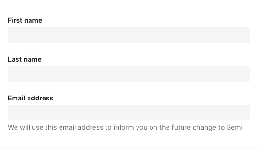
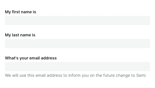
- 表单标签
- 标签是输入框的简短描述。标签不是注释信息(help text),因此不应该是输入框的填写说明
- 标签必须要:
- 放在输入框的上方或下方
- 简短(1-3个词)
- 使用语句的大小写规范(首字母大写,其他小写)
- 帮助文本
- 帮助文本使用语句书写规范,首字母大写
- 表单按钮
- 关于表单按钮的文案规范,参考按钮Button组件的文案规范
| ✅ 推荐用法 | ❌ 不推荐用法 |
| --- | --- | | |
|  |
|设计变量
FAQ
为什么我声明了表单,对值进行了修改,数据没有自动映射到 formState.values 中?
请检查是否正确传入了 field,Field 上的field属性是必填项!!!为什么传入了 defaultValue、defaultChecked 不生效?
请参考文档开头表单控件,Form.Field 组件对默认值做了统一处理,你应该使用initValue或者initValues来传入默认值为什么异步更新了 initValue、initValues 后,组件没有发生变化,值没有生效?
initValue、initValues只在 Field、Form mounted 时进行消费,后续做的异步更新并不会起效。
如果你的初始值需要从远程取,那么你可以在获取到值之后,使用formApi.setValue/setValues进行更新。
或者直接给 Form、Field 传入一个新的key强制它重新挂载为什么调用了 formApi.setValues 更新 fields 的值,但是实际渲染并没有更新?
setValues 默认情况下对尚未存在的 field 进行赋值不会生效。如果你的 fields 是动态加载的话,请检查在 setValues 时,该 field 是否已 mounted。
如有需要,可以使用 override 模式formApi.setValues(newValue, { isOverride: true })为什么 rules 中的 validator 校验失败,但是对应的错误信息没有被展示?
async-validator 的自定义 validator 返回值必须是 boolean 类型,否则它不执行任何回调,semi 后续的钩子也不会被调用。建议通过加 !! 或者 Boolean() 强制转换返回类型
为什么 getValues 拿不到某个 field?
field 没有初始值的话,
getValues获取不到这一项。可以设置initValues/initValue或者给 form 设置allowEmpty属性。为什么在输入框(Input、TagInput……)上敲击 enter 回车键会触发了 Form 的 submit?
这个是标准 HTML 行为,我们不计划进行干预,会与原生保持一致。如果表单内确实只有一个 Input 元素,又不想回车时触发 submit 回调,建议对 Input 的 keydown 事件的 enter 采取 preventDefault 阻止默认行为。
点击 #767 查看相关背景和内容。
表单会自动保存历史输入项,不想要这个功能怎么办?
在 v2.3 之前,Form 并没有严格按照 A11y 无障碍标准为输入控件配置for、name、id等属性,因此在之前的版本并没有该功能。v2.3 后我们严格按照 W3C 标准进行了实现。如果你不希望浏览器自动保存历史输入项,也可以通过在 Form 级别或者 Field 级别设置autoComplete=off关掉