
index-en-US.md 14 KB
category: Getting Started title: From 1.x to 2.0 icon: doc-updateV2 localeCode: en-US
order: 13
Start upgrade
Upgrade preparation
Please submit all your currently modified code and checkout a separate git branch to ensure that the git workspace is clean
Install Semi 2.0
npm i @douyinfe/[email protected]
Modify code
To modify the code related to breaking change, you can manually check the following incompatible list. Check the code one by one and modify it. In addition, we also provide a codemod cli tool to help you quickly upgrade to version 2.0.
1. Install the automatic upgrade tool globally:
npm i @ies/semi-codemod-v2@latest -g // bnpm registry
2. Use semi-codemod-v2 to scan the project code and automatically modify breaking changes
If you want to know the specific scope of automatic changes made by codemod, you can check this document
semi-codemod-v2 <ProjectPath> [options]

//  options:
//    --dry,        Dry run (no changes are made to files)
//    --force,      Whether ignore git status;
//    --verbose=2,  Log level, optional: 0/1/2, default: 0
| Example of use | Command to be executed |
|---|---|
| When you want to scan and upgrade all files of the entire project (The project path is root/workspace/demo-project) |
semi-codemod-v2 root/workspace/demo-project |
| When you only want to scan and upgrade a single file | semi-codemod-v2 root/workspace/demo-project/testFile.jsx |
| When you only want to scan and upgrade a single file, but you only want to output the changes to the terminal without writing the actual changes to the file | semi-codemod-v2 root/workspace/demo-project/testFile.jsx --dry |
// Result output description
Results:
  0 errors       // The number of files in which the conversion rule was executed but an error occurred during the replacement process
  13 unmodified  // The number of files that comply with the matching rule but have not been modified (that is, the component is used, but the related obsolete API is not involved)
  158 skipped    // The number of skipped files that do not meet the matching rule
  4 ok           // A total of 4 files meet the replacement rules, and the cli has been automatically modified
Time elapsed: 5.398seconds
3. For the part that can be recognized but cannot be automatically modified, codemod will prompt on the command line and throw a warning. You need to suggest to modify manually according to the prompts
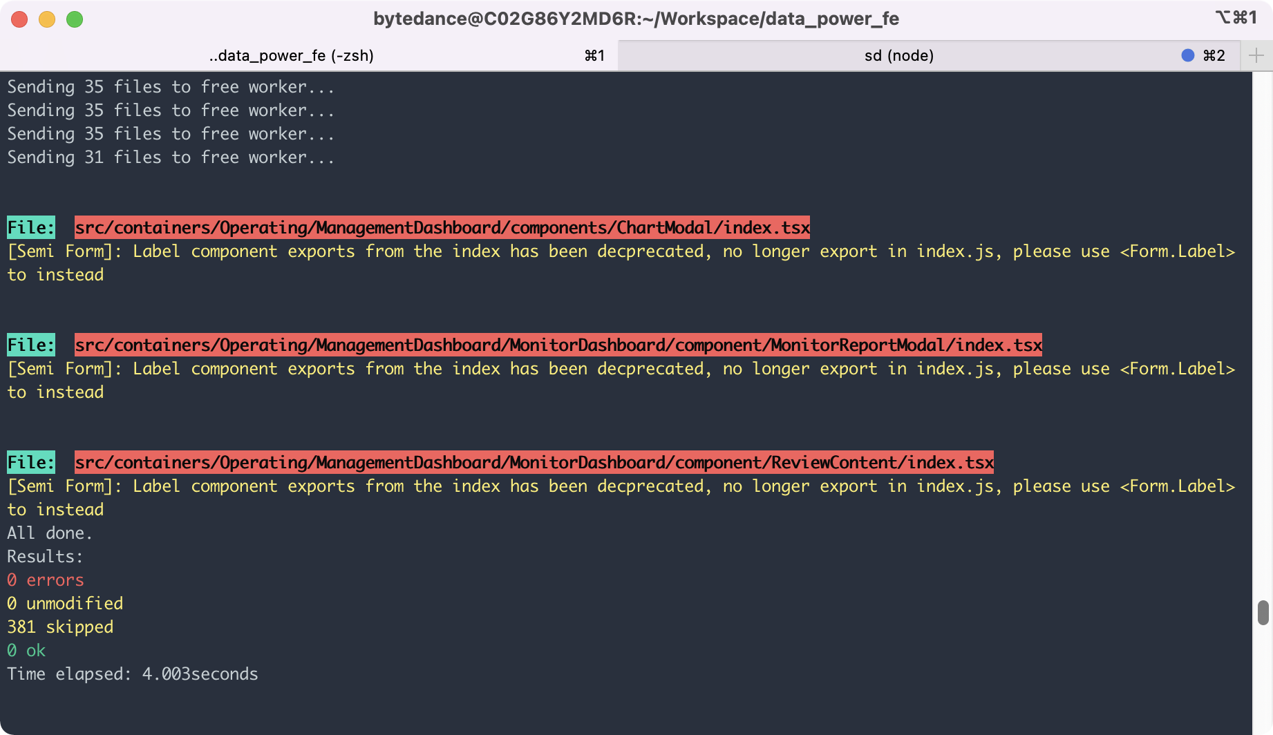 All warning logs will be output in the semi-codemod-log.log file under ProjectPath, and you can check and modify them one by one according to the log.
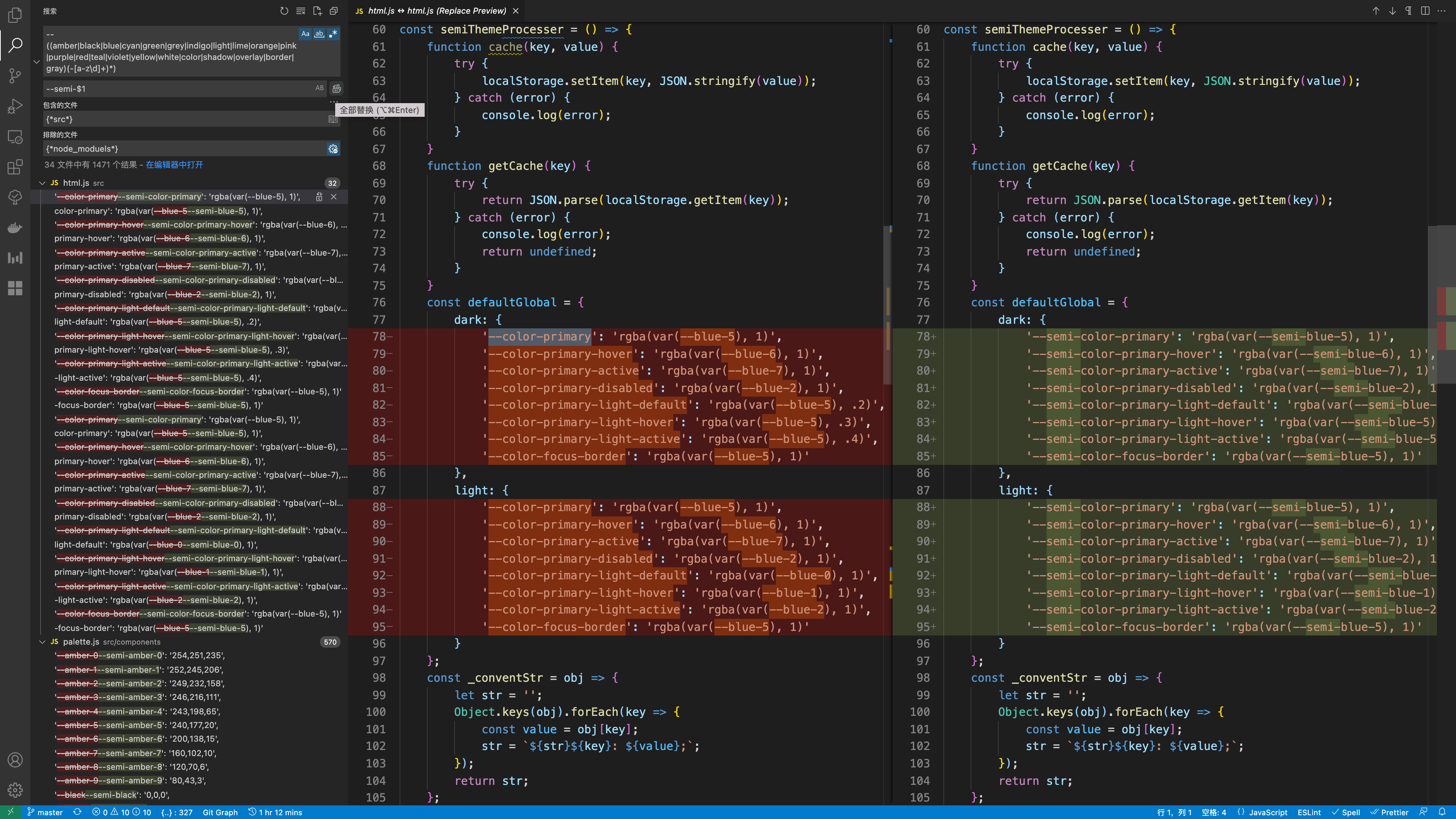
4. Update the usage of Css Variable
If you use Semi's css variable in your code, in addition to using semi-codemod-v2, you also need to use the style-lint tool we provide to automatically update all css varable usage
Install Semi style-lint package
# set npm registry as bnpm
npm i -D @ies/[email protected]
create or update
.stylelintrc.jsonfile{ "plugins": ["@ies/stylelint-semi"], "rules": { "semi/css-token-migrate": [true, { "severity": "warning" }] } }CSS Token updated from 1.x to 2.x
# "**/*.scss" or other files and directories. The tool can process files in JSX, TSX, CSS, SCSS, LESS and other formats files
npx stylelint "**/*.scss" --fix    // Upgrade CSS variables in inline style in SCSS
npx stylelint "**/*.tsx" --fix     // Upgrade CSS variables in inline style in tsx
npx stylelint "**/*.jsx" --fix     // Upgrade CSS variables in inline style in jsx
Automatic replacement depends on stylelint, only replaces the color variables in the style file or style attribute (the quoted value will not be replaced), it is recommended to search globally after the replacement, where there is no clean replacement
// replace '--amber-0' to '--semi-amber-0'
const searchReg = /--((amber|black|blue|cyan|green|grey|indigo|light|lime|orange|pink|purple|red|teal|violet|yellow|white|color|shadow|overlay|border|gray)(-[a-z\d]+)*)/;
const replaceReg = /--semi-$1/;
5. Update the theme package
If you use a custom theme package in your project, you need to go to Semi DSM (the upgraded version of the original Semi theme store) to release the 2.x version of the theme package. And install the new theme npm package into the project
6. Run your project for dev build. Modify the code segment that throws the error
Since codemod relies on the AST syntax tree for analysis and replacement, it is not ruled out that it cannot be detected by AST analysis. And because we refactored TS in version 2.x, the related type definitions will be stricter than 1.x. There may be cases where some type checking can pass in 1.x but fail to compile in 2.x. This type of case will be directly exposed during the construction phase, so you can directly modify the case by case accordingly.
7. Execute git diff review all code changes and return to related pages
At this point, you have completed all the upgrade steps🥳
Although we have considered the user's usage scenarios as much as possible, we still cannot rule out omissions or cases that cannot be detected by relying on AST analysis. The automatic modification/detection of codemod may not cover all scenarios. If you find a case that is not covered by the codemod, you can pull up oncall to give feedback.
Please perform regression testing on all pages with code modifications.
What are the incompatible changes in 2.0
🎁 Package name adjustment
v2.0 Semi is officially released to the public network npm, the package name needs to be adjusted, the original @ies prefix is removed, and the @douyinfe prefix is used.
🔍 Import path change
Import components
// before
import { Select, Input, Form } from '@ies/semi-ui-react';

// now
import { Select, Input, Form } from '@douyinfe/semi-ui';
Import interface(TypeScript project)
All interface related changes can be found in Semi 1.x -> 2.0 TS interface change detailed record
// before
import { SelectProps } from '@ies/semi-ui-react/select'

// now
import { SelectProps } from '@douyinfe/semi-ui/lib/es/select'
Import locale language packages
// before
import en_GB from '@ies/semi-ui-react/locale/source/en_GB'

// now
import en_GB from '@douyinfe/semi-ui/lib/es/locale/source/en_GB'
🛠 API related adjustments
- Icon related
- Icon component no longer supports type = xxx using built-in icons
- Custom svg no longer supports plug-in configuration srcSvgPaths
- The Button
iconandiconTypeproperty no longer supports passing built-in icon names through strings - Dropdown deletes the iconType attribute and unifies it into the icon attribute
- Navigation
iconno longer support incoming by string, ReactNode needs to be passed in - Notification
iconare no longer passed in by string, please use ReactNode uniformly - Banner
icon、closeIconare no longer passed in by string, please use ReactNode uniformly - Typography.Text
iconare no longer passed in by string, please use ReactNode uniformly - Breadcrumb.Item
iconare no longer passed in by string, please use ReactNode uniformly
- AutoComplete officially discards the onChangeWithObject property
- Remove onInputChange from Cascader triggerRender
- Form no longer exports Label components from
semi-ui/index.js - Tree onRightClick renamed onContextMenu
- Upload dragable renamed draggable
- Tooltip no longer supports the
disabledattribute, and components that rely on Tooltip (such as Popover, Dropdown, etc.) transparently transmitted to Tooltipdisabledwill become invalid - Table
- API that no longer responds when componentDidUpdate
- defaultExpandAllRows, please replace with expandAllRows
- defaultExpandRowKeys, please replace with expandRowKeys
- defaultExpandAllGroupRows, please replace with expandAllGroupRows
🎨 Style incompatibility
- CSS variable with semi prefix, for example --color-primary = > --semi-color-primary
- Users who use Semi CSS Variable to implement features such as dark mode need to update the variables in custom CSS uniformly
- Users who do not use Semi CSS Variable in custom components or pages need not pay attention and are not affected
- In 2.x, the unified set the width and height of the illustration to
200 * 200px. If you want to simulate the width and height of 1.x, you can set style = {{width: 300, height: 150}} to the illustration. The common className of the Icon component is changed from
semi-iconstosemi-icon, aligning component namesPlugin adjustment
If you use Semi plug-ins, such as
@ies/semi-ui-plugin-webpackor@ies/semi-ui-plugin-edenetc. to achieve some advanced configuration, you need to understand the following changes:Svg related
- The iconLazyLoad, svgPaths, srcSvgPaths configurations are no longer supported.
Dark mode related
Local dark mode and bright mode no longer need to configure themeScope attributes in the plug-in, and the default is built-in. The usage method is updated from adding id #semi-ways-xxx to adding class .semi-ways-xxx.
Other adjustments
Icon/Illustration use adjustment
In the 0.x/1.x version of Semi, we strongly rely on svg-sprite-loader to convert svg files to svg symbols and insert body at runtime, so that we can use Icon icons only through < Icon type = 'xxx'/> in the form of string. While convenient to use, it also brings some problems: icon is introduced in full by default and cannot be shaken; svg-sprite-loader is strongly bound to webpack and cannot easily support Rollup, Vite, Snowpack and other construction schemes. Therefore, in 2.0, we removed the strong binding with svg-sprite-loader, and the consumption mode of Icon needs to be changed: Icon usage adjustment:
// 1.x default iconLazyload is false
<Icon type="home" />;

// 1.x when iconLazyload is true
import homeSvg from '@ies/semi-icons/semi-icons-home.svg';
<Icon type={homeSvg.id} />;

// 2.x use the following methods uniformly
import { IconHome } from '@douyinfe/semi-icons';
<IconHome />;
Illustration Adjustment:
// 1.x
import { Empty } from '@ies/semi-ui-react';
import Construction from '@ies/semi-illustrations/construction.svg';
<Empty image={Construction} />

// 2.x
import { Empty } from '@douyinfe/semi-ui';
import { IllustrationConstruction } from '@douyinfe/semi-illustrations';
<Empty image={<IllustrationConstruction />} />
Design Token adjustment
| Component | Sass Variable | Before | After |
|---|---|---|---|
| Popconfirm | $color-popconfirm_body-text | var(--semi-color-tertiary) | var(--semi-color-text-2) |
| $color-popconfirm_header_alert-icon | #fa7500 | var(--semi-color-warning) | |
| Progress | $spacing-progress_line_text-marginLeft | 15px | $spacing-base |
| $spacing-progress_line_text-marginRight | 15px | $spacing-base | |
| Radio | $spacing-radio_addon_buttonRadio_large-paddingY | 6px | $spacing-base-tight / 2 |
| $radius-radio_cardRadioGroup | 3px | var(--semi-border-radius-small) |
FAQ
Why has the reference path changed?
In 1.x, Semi uses source code publishing. It will not perform precompilation before performing npm publishing. The Scss and jsx/js of the component library will be compiled together with the business code. In 2.0, precompilation was performed before npm publishing. For ordinary users, precompilation can make Semi work out of the box: there is no need for users to compile Semi source files, and there is no need to introduce Semi plug-ins when using them. Since the compiled results are under lib/es, the reference path of the interface and language package has changed, but for component references, you do not need to change the original reference path (because package.json main attribute points to lib/es/index.js).
The project wants to upgrade to 2.0, but the Semi material is used in the project. The material is based on 1.x Semi. Can it be used at the same time?
No, the css class name of semi2.x is the same as that of semi1.x, and using it at the same time will cause style conflicts. If you encounter similar problems, please initiate an oncall in the Feishu group, and there will be a dedicated person to deal with it.
Why do CSS variables add semi prefixes?
Due to the increasing number of business micro front-end application scenarios, in order to avoid naming conflicts with other library CSS variables and avoid the problem of mutual influence of styles.
Why is the local dark/bright mode changed from add id to add class?
ID is semantically globally unique, while class does not. Using class is more in line with the specification.
Why has the size of the illustration changed?
When using illustrations, the width and height of the illustration of 1.x is 300 * 150px, which is caused by the nesting of the outer layer of the illustration svg. This situation leads to more white space left and right in the original illustration, which is not quite in line with expectations.
Encounter problems
We list all known incompatible changes and related impacts, but there may be some scenarios that we have not considered. If you encounter problems during the upgrade process, please feel free to communicate through the customer service group